VennTeam
A cross-team alignment concept that maps how goals, dependencies and priorities connect across an organization — surfacing misalignment before it becomes a bottleneck.
Context
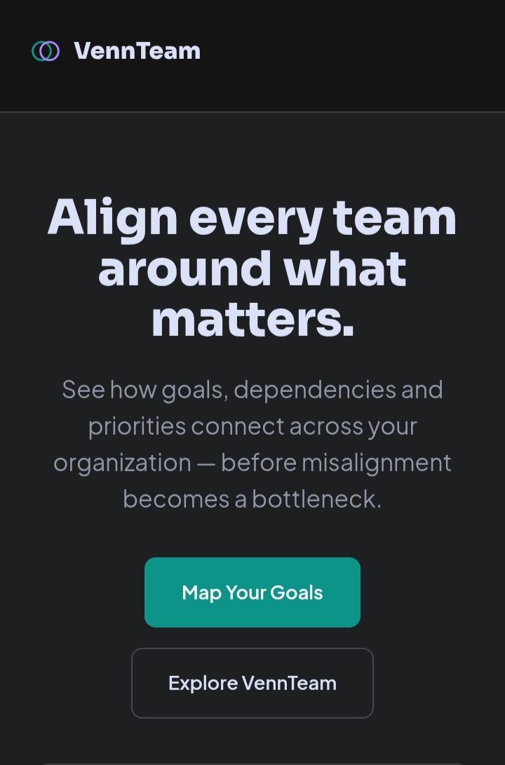
VennTeam is a concept for a cross-team alignment tool — software that visualizes how goals across product, marketing, sales, engineering and operations actually connect, so dependency conflicts surface before they cause a bottleneck instead of after.
The Challenge
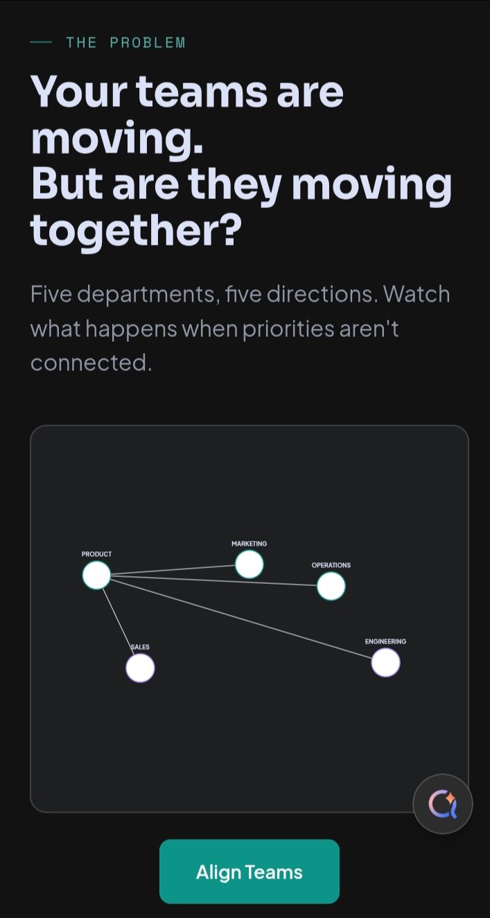
Team-alignment problems are inherently relational — the value is in seeing connections between things, not any single piece of data. The challenge was designing something that shows relationships clearly, not just another list of goals per team.
Objective
Make team structure and working relationships visible inside the product itself, not buried in a separate org chart.
Approach
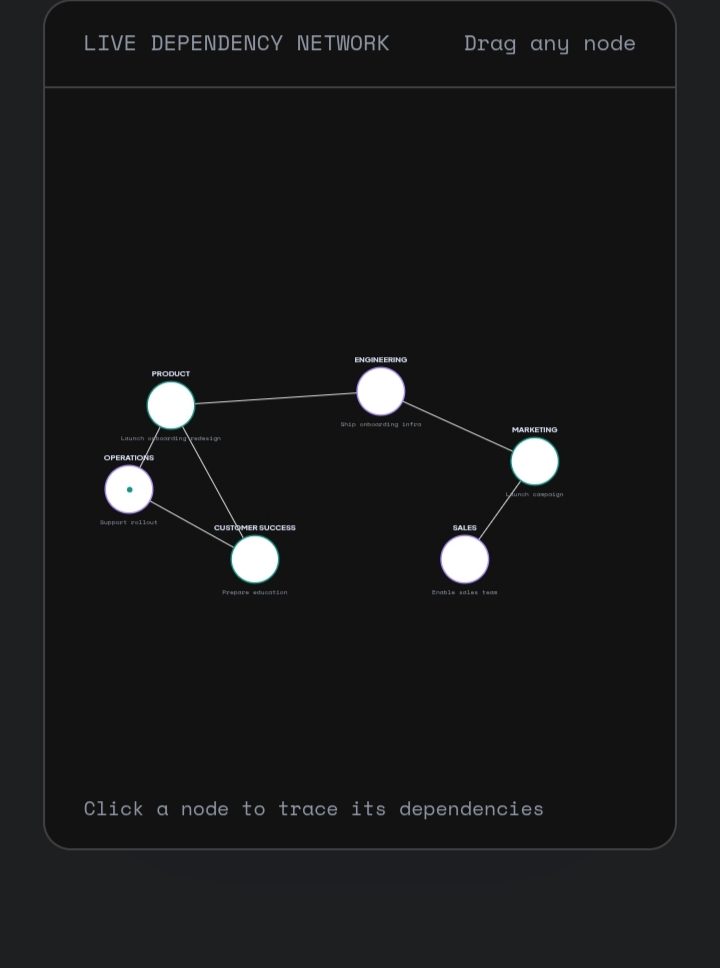
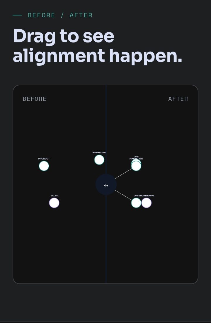
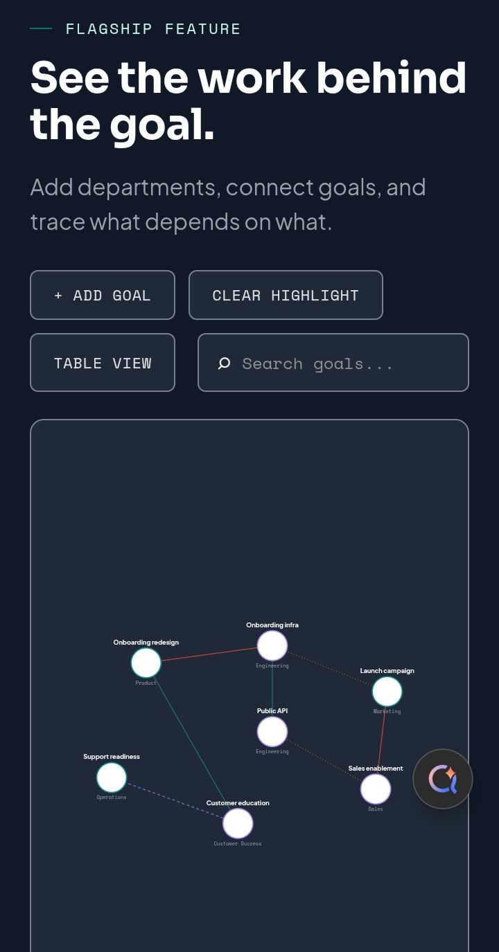
I built the product around a genuine interactive dependency graph: departments as connected nodes, click-to-highlight relationships, and an 'Add Goal' / 'Clear Highlight' toolkit so a visitor can actually explore how one team's onboarding redesign depends on another team's infrastructure work, rather than reading a static diagram.
Design Direction
A dark, structured interface with a teal accent for connections and a purple accent for individual nodes, giving the dependency graph clear, consistent visual grammar as it grows more complex through the page.
Technical Implementation
Built with semantic HTML5, modular CSS and vanilla JavaScript. The dependency graph, delay-impact simulation and team data throughout are demonstration content — there's no live integration with a real task-management or OKR system behind it.
Outcome
A collaboration-software concept that demonstrates cross-team dependency visualization as a genuinely interactive graph rather than a static org chart, while keeping every score and scenario clearly framed as demonstration data.
Lesson
Relationship diagrams are only useful when they change how a user thinks about the team, not just how the page looks.